Power Apps - a new product and a new course
This blog is for those - like us, until recently - who have always wondered what Power Apps is and does, and guiltily wondered whether they should be learning it.
If you need just a one line summary, Power Apps allows you to create apps for phones and tablets to be used internally within your organisation. It's also fun to use, and satisfying (you get to see the results of changes you make to your apps instantly).
Creating your data source in (say) Excel
Let's say you're using Excel to hold your data. There are three distinctive things about Power Apps, as opposed to Power BI: your data must be in a table, it must be stored in the cloud and you can write to it as well as read from it.
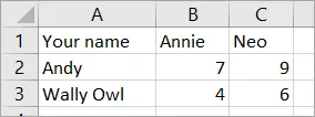
Let's see how this works with a simple survey to see which is the more popular cat - Annie or Neo (regular readers will recognise these as our now not-so-new kittens):

Start by creating a workbook. I've put a couple of votes in to start things off.
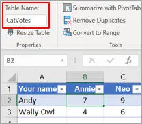
Now make this a table:

Here I've called the table CatVotes. Power Apps wouldn't find the data without this step.
Now I'll save this to OneDrive:

To be able to change data in your data source, Power Apps must be able to connect to it. In practice this almost certainly meanings storing your data in the cloud somewhere.
Creating an app
You can now create an app in Power Apps:

Although there is a desktop version of Power Apps, the modern way to use it is through your Internet browser.
One big difference between Power BI and Power Apps is that you need a basic Power Apps licence to get started (there is no such thing as a free launch). Most readers of this article will have this already as part of their Office 365 subscription.
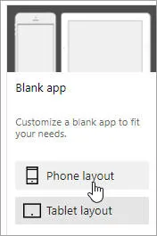
You then need to make an important, and irreversible choice:

Are you designing for a phone or for a tablet? If you're not sure, it's probably best to design for a tablet and then use responsive design to make sure your app shrinks in a well-behaved way when used on a smaller screen.
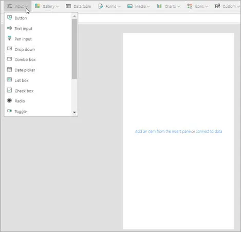
You can now add things to your screen:

I'm simplifying just a tad here!
Adding a data source to your app
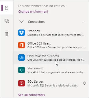
To do this, choose to add a data source:

You can link to a mind-boggling array of different data sources, although most people will use one of the 5 shown here.
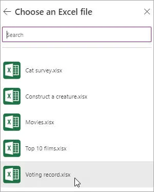
You can then choose a file:

I'll choose the workbook I've just created.
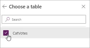
Followed by a table within this file:

The workbook only contains the one table.
Adding a gallery or form
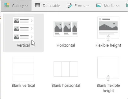
There are 2 main ways to display data - as a gallery, data table or form. Let's start with a gallery:

A gallery is a way to see all of the rows in your data source in a scrolling panel.
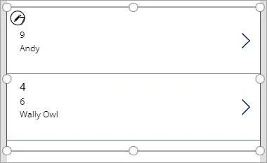
Here's one of the gallery templates you can choose:

A starting point, but where are the kittens?
You can tidy this up and format it:

Hopefully your results will look better than this!
The second (and least important) way to show data is as a data table:

Data tables are quite a primitive way to display rows - you can't do much with them.
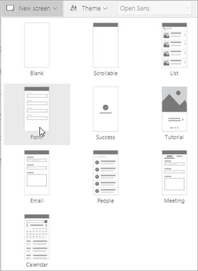
Finally, the third way to display data is as a form:

Forms have lots of templates.
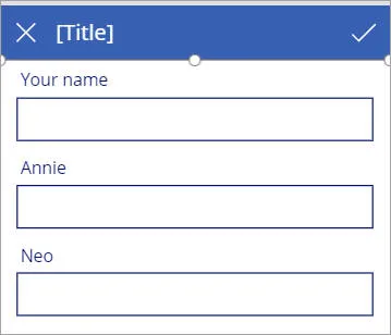
As for galleries, you get a basic template, which you can then edit to your heart's content:

The hard part is making sure that the right cat appears in the right place.
After all of this, here's what Power Apps has done to my workbook:

I presume Power Apps using the unique tracking number to synchronise changes.
Dynamic Properties
At the heart and soul of Power Apps is the ability to set a property of one part of a form to be dependent on another property of another part. As an example, it would be nice if the button below had the same colours as the title (called lblTitle internally):

The button clashes with the label at the top of the form.
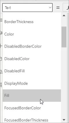
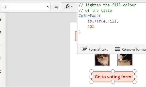
The Power Apps way to change this is to find the Fill colour:

Controls on forms have many properties!
Then set the fill colour to be the same as the label's fill colour - or in this case, lighten it a bit:

This is a fairly typical property value: it uses a built in Power Apps function (ColorFade) to manipulate a property (Fill) of another control (lblTitle).
Another Example of Dynamic Properties
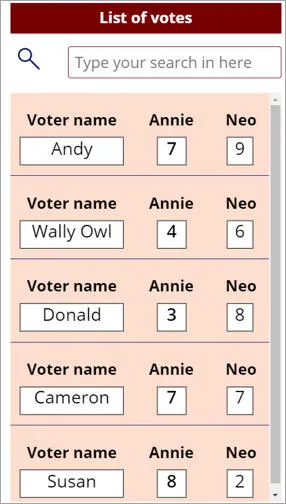
Here's an example of how Power Apps does things. I've added a few more votes to my data table, and now want to enable search:

There is no event or code which makes the search text work. Instead, you just get the gallery beneath it to display names which satisfy the search text typed in.
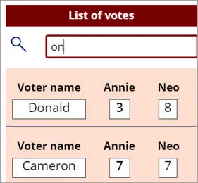
The idea is that the gallery will dynamically update to show the rows which match the search text typed into the box:

Here someone's typed on, so the gallery is listing people whose names contain this string of text.
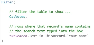
To get this to work, set the data source of the gallery to something like this:

Filter the data source to pick out only the rows whose Your name field contains the text typed into the search box.
Microsoft like to say that you don't need to be a programmer to build Power Apps applications, but this is disingenuous. You may not write much programming code, but you'll spend a lot of your time writing formulae like the ones shown above, and you will need a programmer's logic to build good apps.
Linking to Power BI
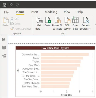
The final thing I wanted to show in this whistle-stop tour of Power Apps is how you can embed an app within a Power BI report, to give an idea of what's possible. First create a Power BI report:

Switching data midstream, this report shows a visual of the top 10 films by box office takings (adjusted for inflation).
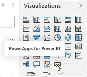
Add a Power Apps visual:

This visual is now standard in Power BI.
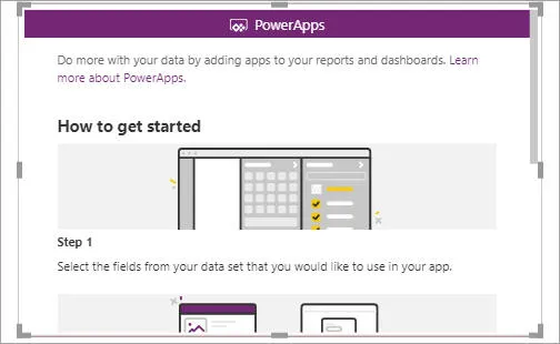
Power BI creates a visual for you (full disclosure - on my current copy, I can't move it, but I'm sure this is a problem I will resolve soon!):

The new visual, prompting you how to proceed.
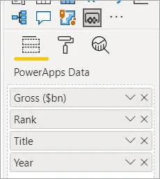
As always in Power BI, tick the fields you want your visual to include:

Our app will allow us to view - and edit - data in these fields.
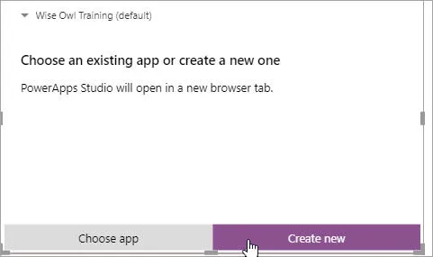
Either use an existing Power App that you've created, or create a new one:

Click as shown to create a new app.
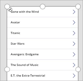
After a couple more conformation questions, you'll be taken to your new app:

By default Power BI adds a gallery to your new app.
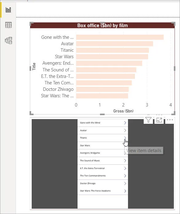
When you save this and return to Power BI, you can see your new app:

You could use this new app to show data, but also - and this is the crucial bit - to edit it, after adding a suitable form to the app.
For many people, this ability to use an app to let Power BI reports make changes to your data will be the big game-changer.
That's it! Power Apps is a big product, and I haven't had the time to do it justice here, but hopefully I've given you a flavour of how it works. Fortunately there's an easy way to find out more: just book a place on one of our online or classroom Power Apps courses.

