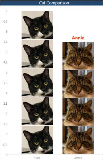
Picture charts in Power BI (the Infographic Custom Visual)
This blog was inspired by one of Shaun's recent courses, which degenerated
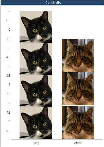
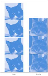
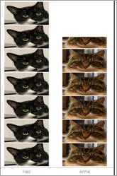
into creating charts showing pictures of pets! A bit like this, in fact:

Regular readers may recognise Annie and Neo.
This blog shows how to create charts like the one shown above!
This doesn't claim to be a complete tutorial on the Infographic custom
visual, but it should give you enough ideas to get going. You can download
the files you'll need here if
you want to follow along (or just to see the final report).
Step 1 - Assemble your resources
So to produce the chart above, I've created an Excel workbook:

One thing I didn't realise when we got cats: how much the local wildlife would suffer!
I then loaded this into a new Power BI report:

The data records the number of units of wildlife removed from the ecosystem in a given week (although the true figures aren't quite this bad!).
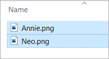
Finally in preparation, I copied these two pictures from my phone onto my
computer:

Annie and Neo: lovable, furry playthings or savage cold-hearted killers?
Step 2 - Import the Infographic custom visual
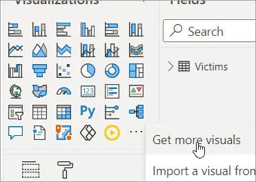
As always for custom visuals, click on the ...
button and choose to get more visuals:

Click on the ellipsis tool in the visualisations tool palette and choose this menu option.
Add this custom visual:

Add this custom visual to your report.
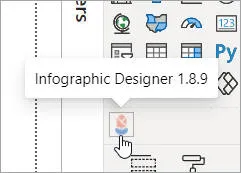
You can now click on the custom visual's less-than-inspiring icon to add the
visual to your report:

Click on this tool to add an Infographic to your report.
Step 3 - Creating the basic chart
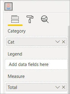
Now add fields to your chart:

We are going to show total kills by cat.
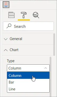
Choose whether you want a column, bar or line chart:

We're going to work with a column chart (the default type).
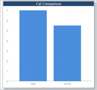
You should now have a chart to work with:

I've also formatted the title, removed the gridlines and added a border and shadow.
Step 4 -
Starting to edit the chart settings
You're going to need all the room you can get, so it's a good idea now to
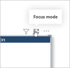
invoke focus mode:

Click on this icon to make your visual temporarily fill your report page while you work with it.
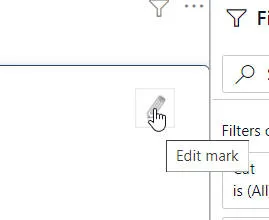
To go into editing the visual's settings, click on the pencil icon which appears
when you hover over the visual:

This icon appears when you hover over the visual.
Step 5 - Adding the pictures
An infographic visual consists of one or more layers which appear stacked up
on top of each other. At the moment you only have one, a shape:

More specifically, we currently have a blue rectangle.
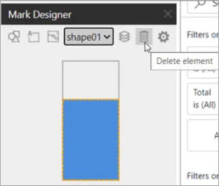
We want to remove this, so click on the dustbin icon:

Click on this icon to remove the current layer.
You'll then be left with a blank chart.
You can add 3 types of thing to an infographic custom visual:

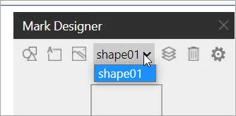
From left to right, these icons add a shape (there are
lots of clipart-type shapes to choose from), text or an image.
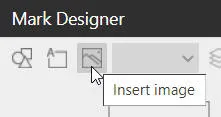
In our case we want an image:

To add an image, click on this icon.
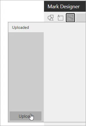
Click on the easy-to-miss Upload button:

Click on this button to upload one or more images.
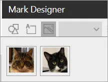
Choose the images you want to upload:

|

|
|
The images ...
|
... and what you should then see |
Click on one of the images above (I chose Annie) to get something like this:

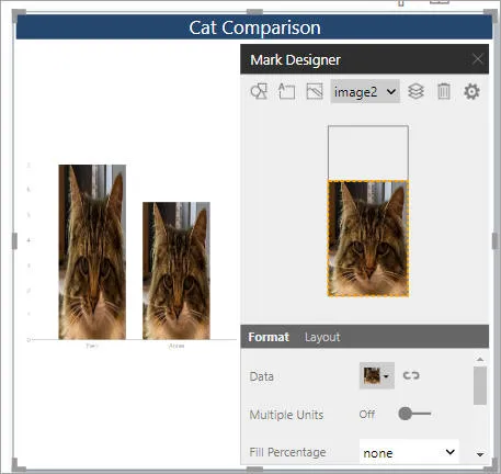
We now need to show different images for different columns, and stack rather than stretch the images.
Read on to see how to do this!
Step 6 -
displaying different images for different data
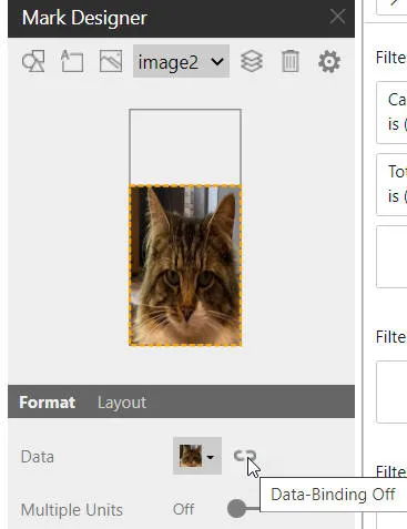
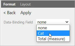
To associate each cat with its own data, choose to set data binding:

Click on this icon to tell Power BI to display a different thing for each column.
We want to display different things for different cats:

Choose to vary what you see by cat.
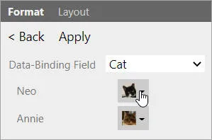
Click on the tiny drop arrow next to each cat, and assign it to the correct
picture:

Neo is black and white; Annie isn't.
Click to apply your changes:

You won't see any change until you click on this button.
Step 7 - Formatting the pictures
Click on the < Back button above, then choose
to show multiple pictures for each column:

Turn multiple units on to see more than one cat per column.
Your cats may look a bit washed-out now:

You have a whole number of cats per column.
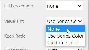
I'm not sure why Power BI adds the tinting, but you can immediately remove it:

Set the value tint to
None to return to the status quo of cat colours.
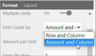
If you want each cat to represent one unit, change this setting:

Set the amount per unit to depend on the amount and column.
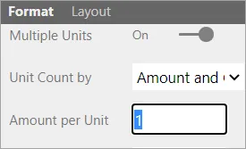
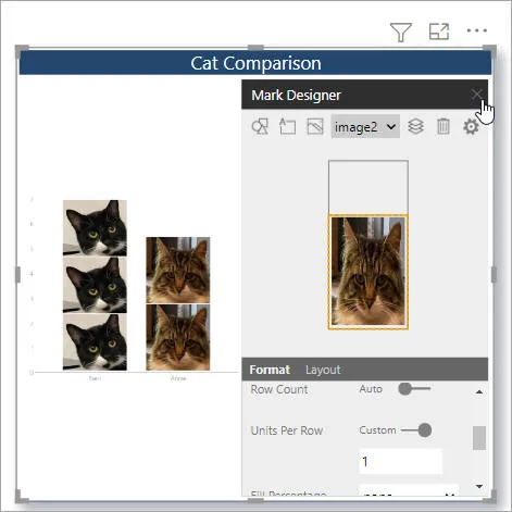
You could then set the amount per unit to be 1:

One cat per unit, please!
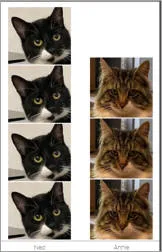
This will give this effect, but I'm going to change the unit count back to
Row and Column because I think it looks better:

|

|
|
One cat per unit |
Row and Column units |
Step 8 - Reviewing where we're up to
Click on the cross as shown below to view your visual normally:

Click on the cross to exit this mode.
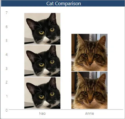
Not bad:

We just need to display some text at the top of each column showing the name of the cat.
Step 9 - Adding a text label
To overlay a text label at the top of each column, add text:

Choose to add a text layer to your visual.
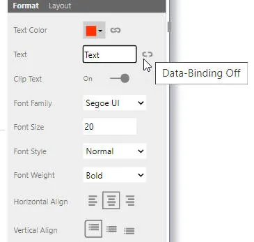
Format it to taste, then click on the data binding icon:

Here I've set my label to be 20 point centre-aligned and bold.
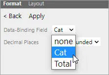
In data binding, assign the Cat field to the text of each
label:

Bind the value of the text to the
Cat field value, then click on Apply.
Step 10 - Positioning the text labels
The only remaining problem is that you probably can't read the text labels
you've created!

We need to move the labels above the columns.
To remedy this, click on the Layout tab:

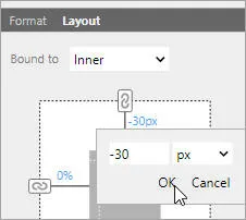
Choose to change the layout of your labels.
You can now change the top padding from Auto to this:

If you set the top distance to -30px, the labels should appear above each column.
What I can't do is work out how to get the largest column's label to appear:

An exercise for the reader: how do you get the column label to appear for Neo, whose column is the biggest?
I can't believe I didn't know how to do this before. All of my reports
will have picture charts in now!
