What UserForms are
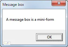
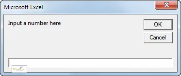
A UserForm (or just form) is a dialog box that you create yourself. You've almost certainly already seen some pre-created forms in Visual Basic for Applications:
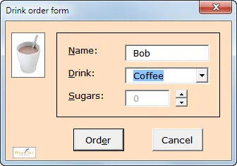
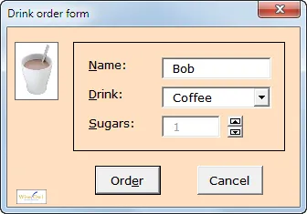
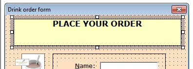
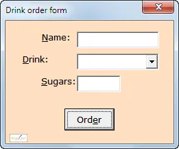
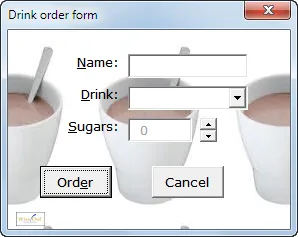
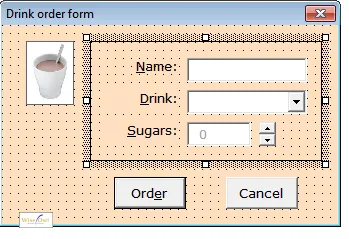
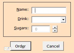
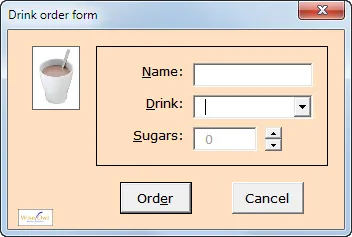
However,neither of these can be customised much. A UserForm, by contrast, can have lots of widgets and formatting on it:

This user form allows someone in your office to order a drink.
UserForms aren't limited to Excel: Word, PowerPoint and SharePoint Designer use the same software (although Access and Outlook, typically, do their own thing).
Pros and Cons of UserForms
Should you learn to create and use UserForms? Have a look at the pros and cons below, and make up your own mind! Let's start with the good things:
Advantage | Notes |
|---|
Impressiveness | There's nothing like a custom form laden with drop down lists, command buttons, pictures and formatting to impress a client or manager. |
Ease of use | For people who don't enjoy inputting data directly into Excel, you can create a front-end form instead and make it as easy to use as possible. |
Those are powerful advantages; how about the other side of the coin?
Disadvantage | Notes |
|---|
Validating data | Creating user forms is easy; making sure that users input data correctly takes longer. On a worksheet you can use tools like data validation and protection to ensure users enter the right type of data, but in a form you're going have to work much harder to avoid errors. |
Flakiness | My experience from many years of training on Excel and writing systems is that user forms occasionally crash - Excel itself rarely does. |
Now that you know what a form is, let's look at how to create one, and how to attach macros to it.
Creating a Form
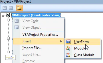
It's easy enough to create a user form in VBA - within the code editor, just right-click and choose to add a user form:

Right-click in a project/workbook and choose the option shown to insert a user form.
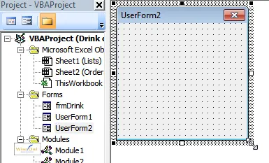
You'll be shown a rectangular form, which you can resize using the bottom right corner:

Click and drag on the bottom right corner to resize a user form - it will always appear at the top left corner of the code editor window.
Just like macros, a user form is stored as part of a workbook, rather than in a separate file.
Controls
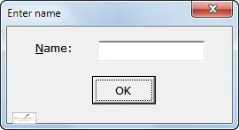
The things that you add to a user form are called controls. The following simple form has 3 controls:

This form has 1 label, 1 textbox and 1 command button.
The following drinks order form has more than 10 controls:

This relatively simple form contains 11 controls!
A later tutorial in this series shows how to add some of the more esoteric controls - for now, we'll stick to general principles.
Drawing Controls on a Form
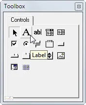
You can draw any control on a form using the Toolbox:

The form Toolbox - the simplest controls are shown at the top left.
If you can't see your Toolbox window when you have a form open, try clicking on the Toolbox tool:

Click on the tool shown to display the Toolbox, if it's gone AWOL.
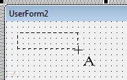
Once you've chosen your control tool, you can click and drag on your form where you want it to go:

Here the mouse pointer shows that you are drawing a Label control.
It's often easier just to click where you want a control to go, and Excel (or any other application) will draw it with a standard size and shape.
Having learnt how to draw controls, let's move on to how to show their properties.
Setting Form Properties
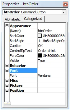
If you spend much time designing forms, you'll need the Properties window to be permanently visible:

The Properties window allows you to make changes to any aspect of a form or its controls.
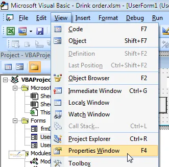
You can display the Properties window using the menu:

Choose the menu option shown to display the Properties window.
Alternatively, you can press F4 or click on this tool:

Click on the tool shown to display the Properties window.
Alphabetic or Categorised Properties
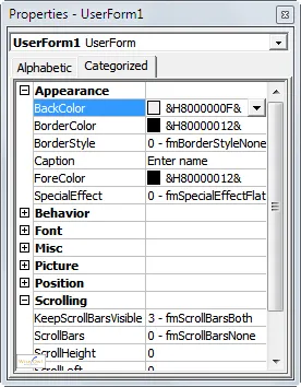
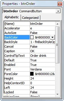
You can either display your properties in a list from A to Z, or choose to divide them into categories, depending on which tool you click on at the top of the Properties window:
 |  |
Alphabetic listing | Categorised listing |
I'm not sure I have any recommendation, but the rest of this tutorial will always use the Categorised (or should that be Categorized?) view.
Selecting a Single Control
To format any controls on a form, you first need to know how to select it/them.
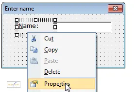
To change the format of a single control, click on it to select it and use the Properties window:

Right-click on any control to show its properties, as shown here, if they're not already visible (as already mentioned, you can also press F4 at any time to bring up the Properties window).
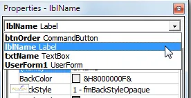
Alternatively, you can select a control in the Properties window itself:

Click on the drop arrow shown to choose the control whose properties you want to change.
Selecting Multiple Controls
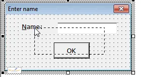
There are several ways you can select lots of controls at the same time. The easiest way is probably with the mouse button:

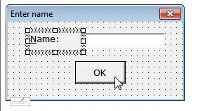
Click and drag on the form to draw a rectangle, making sure that you start on a blank part of the form. Any control that this rectangle touches or encloses will be selected. This example would select all 3 controls.
Alternatively, you could use the SHIFT or CTRL keys:

In this example, if you click on the OK button as shown:
Alternatively, you could press CTRL + A to select every control on the form in one go.
The Dominant Control
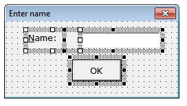
If you select multiple controls, one (and only one) of them will have white handles surrounding it; all of the others have black ones. The one with the white handles is called the dominant control:

Here the label containing Name: is the dominant control. If you have a number of controls selected, you can click on any one of them to make that one the new dominant control among those selected.
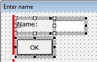
What this means is that if you choose to align or size the selected controls (as shown later in this tutorial), they will do be aligned or size by reference to the dominant control:

The results of aligning the controls shown above by their left edges. Everything lines up to the red line shown, since that is the left edge of the dominant control.
Selecting a Whole Form
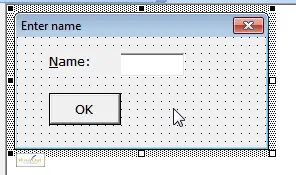
If you want to change properties for a form (such as its name), you need to select it:

Click anywhere on a form apart from on one of its controls to select it, as shown here.
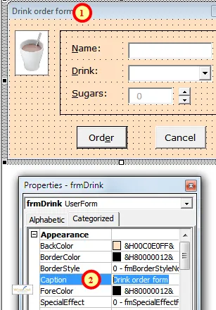
The Form Caption
To change a form's caption:

To change the caption of a form, change its Caption property.
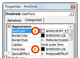
Changing Background and Foreground Colours
You can select any control(s) or the form itself to change their colours:

Change the BackColor and ForeColor properties to alter the colours of a control.
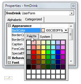
When changing colour properties, be sure to use the Palette of colours and not System colours:

Choose the Palette tab to see what colours you are choosing!
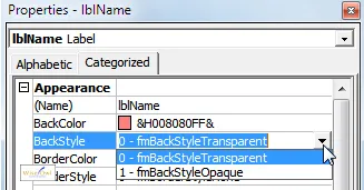
You can set a control's background colour to transparent in a slightly different way:

Change a control's BackStyle property to transparent to make it the same colour as the form it sits on.
Font or Typeface
To change the font of control(s) initially doesn't seem very promising:

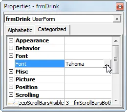
When you click in the Font property, a build button (with 3 dots on) appears. Click on this!
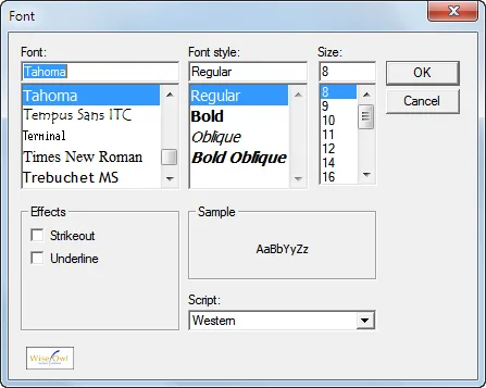
However, when you get to the Font dialog box, everything should be straightforward:

Phew! Hopefully this now looks familiar.
Horizontal Alignment (within Controls)
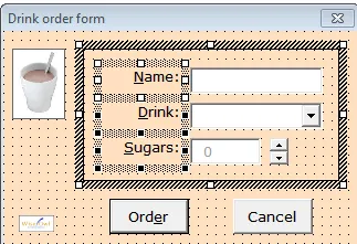
In the form below, the selected labels are right-aligned horizontally:

The default alignment is left-aligned, so someone has changed these controls.
To change horizontal alignment, you'll probably expect there to be tools like this:

There should be tools like this. Where are they?
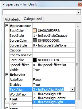
Failing that, you'll probably look for the Alignment property, but in neither case will you have any joy. It's the TextAlign property (of course!) that you want:

The TextAlign property has 3 less than obvious possible values.
Vertical Alignment within Controls
Vertically aligning text within a control is simple - you can't do it in user forms!

If you want the title to appear in the centre of its box vertically, you'll have to press Enter before it.
Centre-Aligning Controls on Forms
In the screen shot below, the command button is centre-aligned horizontally on the form:

The Order button is horizontally centred on the form.
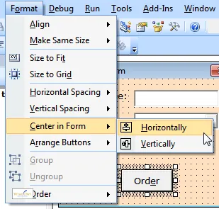
To achieve this, select the control in question and choose one of the following options:

You can centre a control in the middle of a form going across or down.
Setting Borders for Controls
You can set the colour and thickness of a control's border:

This control has a black border.
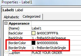
To do this, set the two properties shown below:

It's no use setting a border colour if you don't also set the border style too.
Four Properties you Probably Shouldn't Change
There are some properties I reckon you shouldn't change!

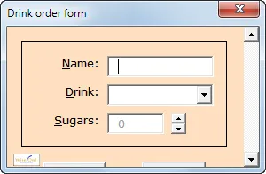
The Picture property allows you to set a background picture on a form, but they always obscure the contents. You can tile, stretch and zoom pictures, but the best thing to do with them is delete them!

You can set the ScrollBars property of a form to Horizontal, Vertical or Both, but you'd be much better off designing your form properly (using MultiPage controls if necessary) so that you don't need them.

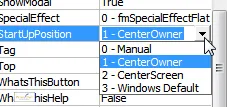
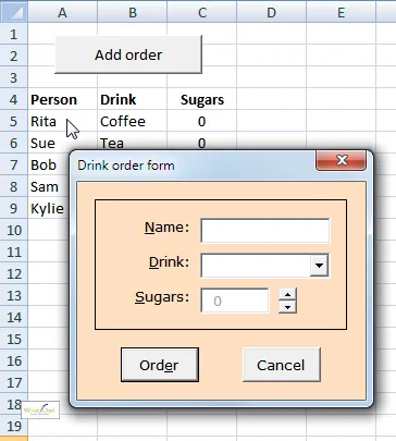
A form has a start-up position property, but the most sensible position seems to be in the middle of the parent application (Excel), which is the default, as shown here.

A form has a Modal property: if you set this to False, your users can ignore the form and click in Excel, which probably isn't a good idea.
Aligning Controls to Each Other
Now that we've looked at formatting a form and individual controls on it, let's move on to formatting multiple controls relative to each other: that is, aligning, sizing, spacing and grouping controls.
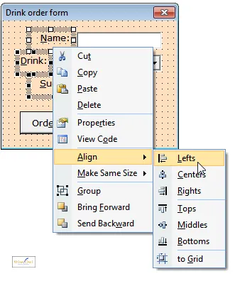
To align controls, select them and choose the right-mouse button options shown below:

Here the Name: label is the dominant control, so selecting Lefts as shown will align the selected controls to its left edge.
Equally Spacing Controls Horizontally or Vertically
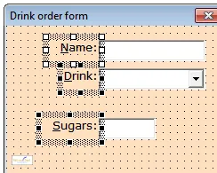
In the form below, the controls need distributing equally:

The control would look better equally spaced in this case.
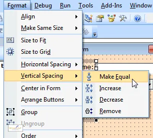
To do this, select the controls as shown and then choose one of the menu options shown here:

The option shown is the one we want in this instance, but it's reasonably obvious what the others would do.
Note that in this case you would then have to do the same thing to the textboxes/combobox, to get them to align in the same way.
Making Controls the Same Size as Each Other
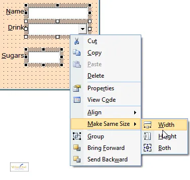
Here's how to get 2 or more controls to have the same size or width:

Select the controls, then right-click on one of them and choose the menu option shown here. The Drink combobox is the dominant control, so the other two selected controls will be resized to have the same width as this one.
Grouping Controls
When you've drawn part of a form, it's often useful to group its controls together so that they behave as a single control:

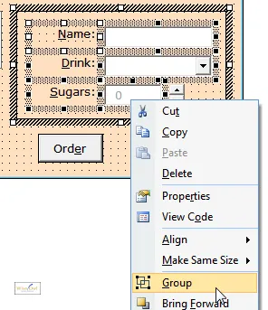
Here we want to group all of the controls in the frame together so that we can move them around as one.
One way to do this is to select all of the controls and group them together:
 |  |
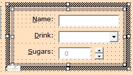
Group the controls like this ... | ... and they'll be selected as one. |
Even after grouping controls together, you can still format individual controls within the group separately, so you get the best of both worlds.
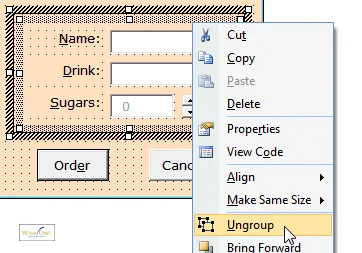
You can ungroup grouped controls in the same way:

Right-click on a grouped set of controls and choose to ungroup it as shown here.
Using Frames to Group Controls
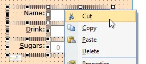
An alternative way to group controls together is by creating a frame to hold them. First cut any controls you want to appear on the frame:

Select any controls you want to group together, and cut them to the clipboard.
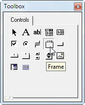
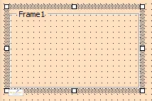
Click on the Frame tool, and use it to draw a rectangle:

Click on this tool, and draw a rectangle for your frame.
You can now delete the title of the frame, and paste your controls on to it:

Delete the Frame1 title (it's the Caption property of the control) to make it look tidier, then paste the controls from the clipboard onto the frame (make sure you have it selected when you do this).
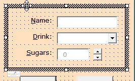
Result: wherever the frame goes, so too do any controls sitting on it:

When you move the frame, the controls on it move too.
You could always set the BorderStyle of the frame to frmBorderStyleNone to hide its border, if you don't want to see the rectangle.
Controlling Tab Order
This part of the tutorial shows you how to make sure that short-cut keys, and the Enter, Tab and Cancel keys work as you would wish for a form.
What will happen on a form when you press the Tab key? The answer depends on the tab order of the form:

What will happen when you press Tab? You want the cursor to jump to the next control which can "receive focus" - that is, the Drink: combobox.
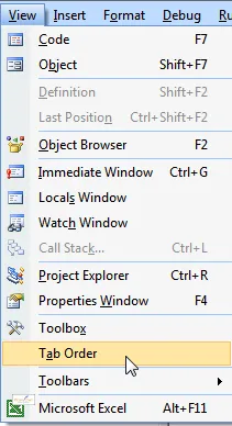
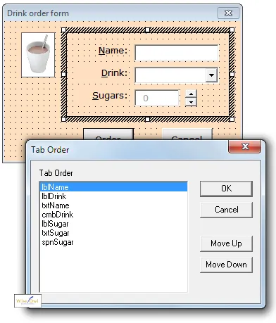
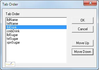
To set this tab order, either select the form or a Frame or MultiPage control on it. If you select the form, you'll see the form's tab order:

Either select the form itself, or a Frame or MultiPage control on it, then select to change the tab order as shown.
If you have a Frame or MultiPage selected, you'll only see some of the form's controls:

Because you have a frame selected, you can change the tab order of the controls within the frame only.
It may seem odd that the tab order includes labels, when these can't receive the focus (you can't click on them) and hence are nothing to do with tab order. Read on to find out how accelerator keys require labels to appear in the Tab Order dialog box.
Accelerator Keys (Short-Cut Keys)
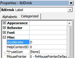
In the form below, you can press ALT + D to jump to the Drink: combo box, since the label has the D underlined:

The underlined letter D is called an accelerator key.
You can only attach accelerator keys to labels, not textboxes or comboboxes. What will happen when you press ALT + D for the above example is that the cursor will jump to the next control which can receive the focus following the Drink combobox in the tab order.

The reason that you will go to the Drink: combobox above is that it is the first control after the lblDrink label which can receive focus (ie which you can click in).
As to how you attach accelerator keys - that's the easy bit:

Just type in a letter for the oddly-named Accelerator property .
The Default Button (the ENTER Key)
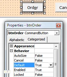
When a form appears in Windows, usually one button has a slightly thicker border. When you press Enter, this is the one Windows will select:

Here the Order button has a slighly darker border, and is the one which will be chosen if you press Enter.
To make a button the default, assign its Default property to True:

Select the Order button for our example, and set the Default property to True.
Note that you can only have one default button on a form - so if you make another button the default, this will deselect this one.
The Cancel Button (the ESCAPE Key Button)
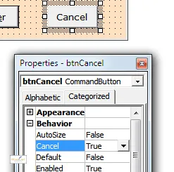
Similar to the Default button above, the Cancel button is the one that Windows will choose when you press ESC.

Select the Cancel button, and set its Cancel property to True. When a user presses ESC, this will then run any code attached to this button. Just like for the Default button, you can only have one Cancel button per form.


