The new formatting pane is now live (sort of)
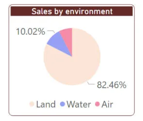
Microsoft have redesigned every single formatting card! I'll use this pie
chart as an example to illustrate the changes (because after all, everyone loves a pie chart - don't
they?):

A formatted pie chart.
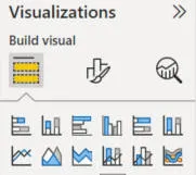
When you click on a visual (or page), the format icon is above the
visualisations palette, not below it:

When you click on the
new formatting icon, the visualisations pane sensibly disappears, to give Power BI more room to display formatting cards.
The new formatting toolbar is still in preview, but is (allegedly) turned on by
default - hence my reason for including it in this blog:

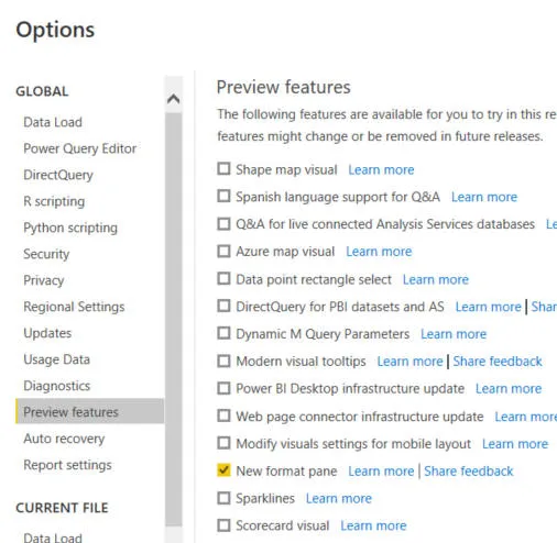
I say allegedly because on my version of Power BI
for some reason I still had to tick the box shown in File
-> Options and settings -> Options.
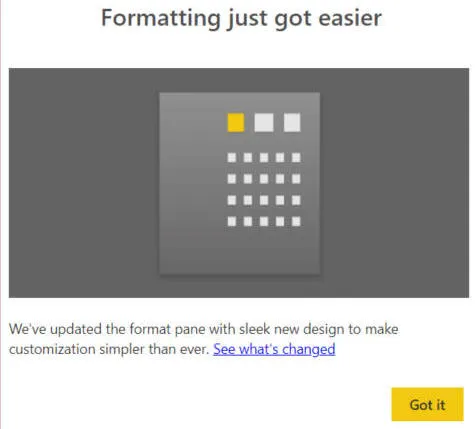
When you first go into Power BI after the new update is installed, you should
see this card:

Again, I only saw this
message after I manually enabled the preview feature.
I've summarised the main changes for the new formatting cards below, under
different headings.
The new changes are excellent and well-thought-out, but spare a thought for
the poor Wise Owl courseware author: almost every page of every one of our Power BI manuals (and
almost every Power BI exercise too) will now need rewriting! We aim to get
this done within a week or two of this new update coming out.
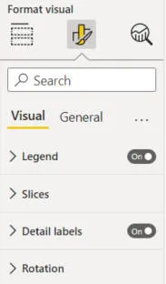
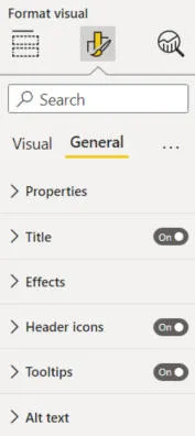
Division of Properties into Specific and General
If you look at the formatting properties of our pie chart (or any other
visual), they're divided into two parts:

|

|
|
Specific to this visual |
General for all visuals |
So every visual has got a title, background colour and border (hidden in the
Effects category above), but only some visuals have legends, slices, detail
labels and rotation.
This means that if you're looking for a visual's title, for example, it will
always be on the General tab, making properties easier to find.
Categories and Subcategories
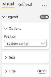
Formatting cards are divided into categories:

Here's what you see for our pie chart's legend, for example.
You can expand or collapse any category:

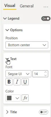
If you click on the arrow shown next to a pie chart's legend's
Text subcategory card, you'll see its properties.
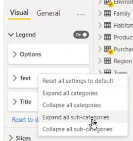
You can easily choose to show all of the categories for a visual (or subcategories
for a category) by
right-clicking:

Choosing this option would show all of the subcategories for the
Legend card, but wouldn't affect any other cards.
Different Presentation
Properties like fonts are easier to use than before:

You can see all of the font properties in theis card, without needing to click.
Also, on/off properties have been redesigned to take up less room:

I thought the old ones looked a bit nicer, but I can see that they took up more room.
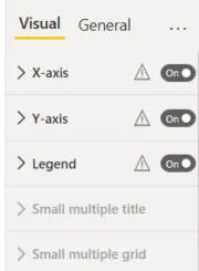
If a card or property could exist, but would not be applicable for the
current visual, it's often shown greyed out:

This visual could have small multiples, but for some reason you can't apply them as things stand.
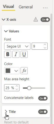
Above all, there are no more double scrollbars!

When you expand an axis title, the scroll bar automatically extends to accommodate the new subcategory properties uncovered.
Using the tiny double scroll bars for axis titles required advanced mouse
skills, and we are glad to see the back of them!
Renaming and Re-ordering of Properties
Microsoft have taken advantage of the introduction of a new formatting pane to redesign all of the
formatting cards in Power BI (they were getting a bit unwieldy, having grown
piecemeal over time as new features were rolled out). Here's one example
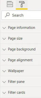
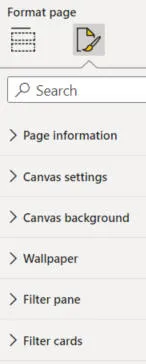
for a page's format properties:

|

|
|
Before ... |
... and after |
This is typical: some things have been renamed and moved, while other
properties are unaffected.
I've found that all of the changes made are sensible, and it doesn't take
long at all to get used to the new formatting cards.
Highlighting of Search Text in Results
It's the little things ...

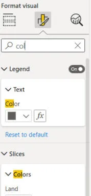
If you search for properties containing a given string of text, Power BI will highlight the characters that you searched for in yellow in any results.
Applying Properties
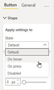
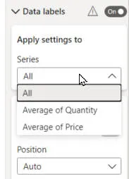
It's now easier to choose which properties apply to which parts of a visual. Here are two examples:

|

|
|
Button state
|
Data series |
The example on the left shows how you can choose which action button state
you're formatting, while the one on the right shows how you can choose which
data series you're formatting.
Overall Verdict
Microsoft are to be commended for taking a step back from the Power BI
formatting cards, which were beginning to get messy and unwieldy, and
redesigning them to be much easier to use. Just a shame we now have to
change all our manuals and exercises!
Watch out for missing properties and cards. I've been using the preview
version for a while and found two or three cases where it wasn't possible to do
something because the necessary property hadn't been exposed. I suspect
these problems will all have been ironed out now, but a few visuals
(such as decomposition trees and the Power Automate visual) don't yet fully support the new
formatting look-and-feel.


